React JS is a popular JavaScript framework for building front-end applications, such as user interfaces that let people interact with software. When it comes to developing modern React apps, choosing the right library might be difficult. Therefore in this article, I have compiled the best and useful packages that you need as a React developer.
Axios
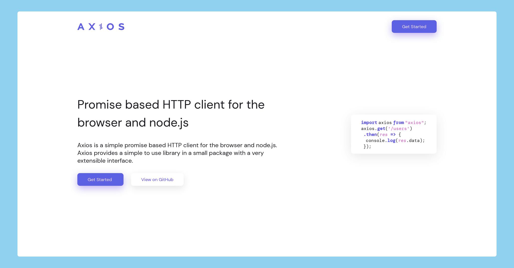
Axios makes it simple for us to communicate with APIs in our React projects. Though alternative techniques like Fetch or AJAX may do this, Axios can give extra functionality that goes a long way with React-based apps.
Installation
- Using NPM
npm install axios
- Using Yarn
yarn add axios
Usage
import axios from 'axios'

// Make a request for a user with a given ID
axios.get('/user?ID=12345')
  .then(function (response) {
    // handle success
    console.log(response);
  })
  .catch(function (error) {
    // handle error
    console.log(error);
  })
  .then(function () {
    // always executed
  });
Redux
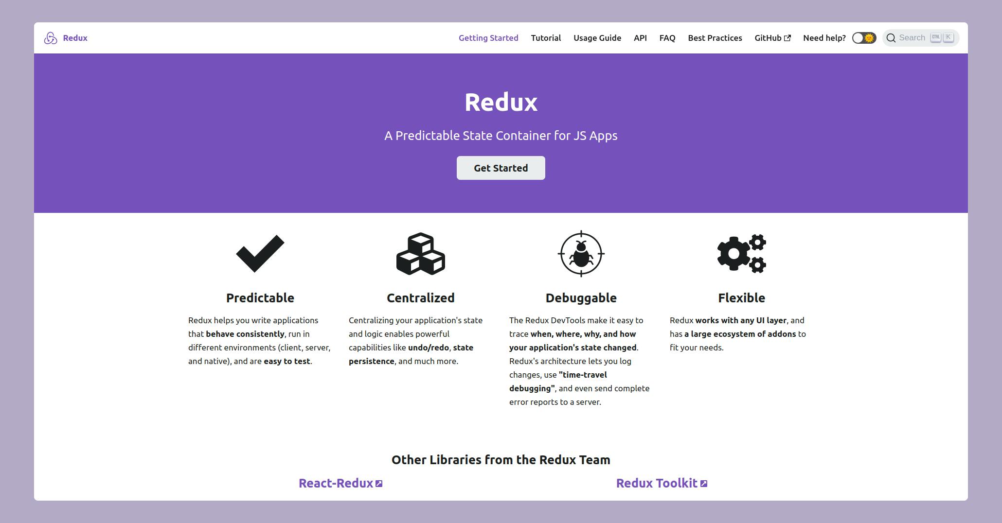
Redux is a JavaScript library that allows you to manage and centralize your application's state. For creating user interfaces, it is most often used alongside frameworks like React or Angular.
Installation
- Using NPM
npm install redux
- Using Yarn
yarn add redux
Usage
import { createStore } from 'redux'


function counterReducer(state = { value: 0 }, action) {
  switch (action.type) {
    case 'counter/incremented':
      return { value: state.value + 1 }
    case 'counter/decremented':
      return { value: state.value - 1 }
    default:
      return state
  }
}

// Create a Redux store holding the state of your app.
// Its API is { subscribe, dispatch, getState }.
let store = createStore(counterReducer)

// You can use subscribe() to update the UI in response to state changes.

store.subscribe(() => console.log(store.getState()))

// The only way to mutate the internal state is to dispatch an action.
// The actions can be serialized, logged or stored and later replayed.
store.dispatch({ type: 'counter/incremented' })
// {value: 1}
store.dispatch({ type: 'counter/incremented' })
// {value: 2}
store.dispatch({ type: 'counter/decremented' })
// {value: 1}
Formik
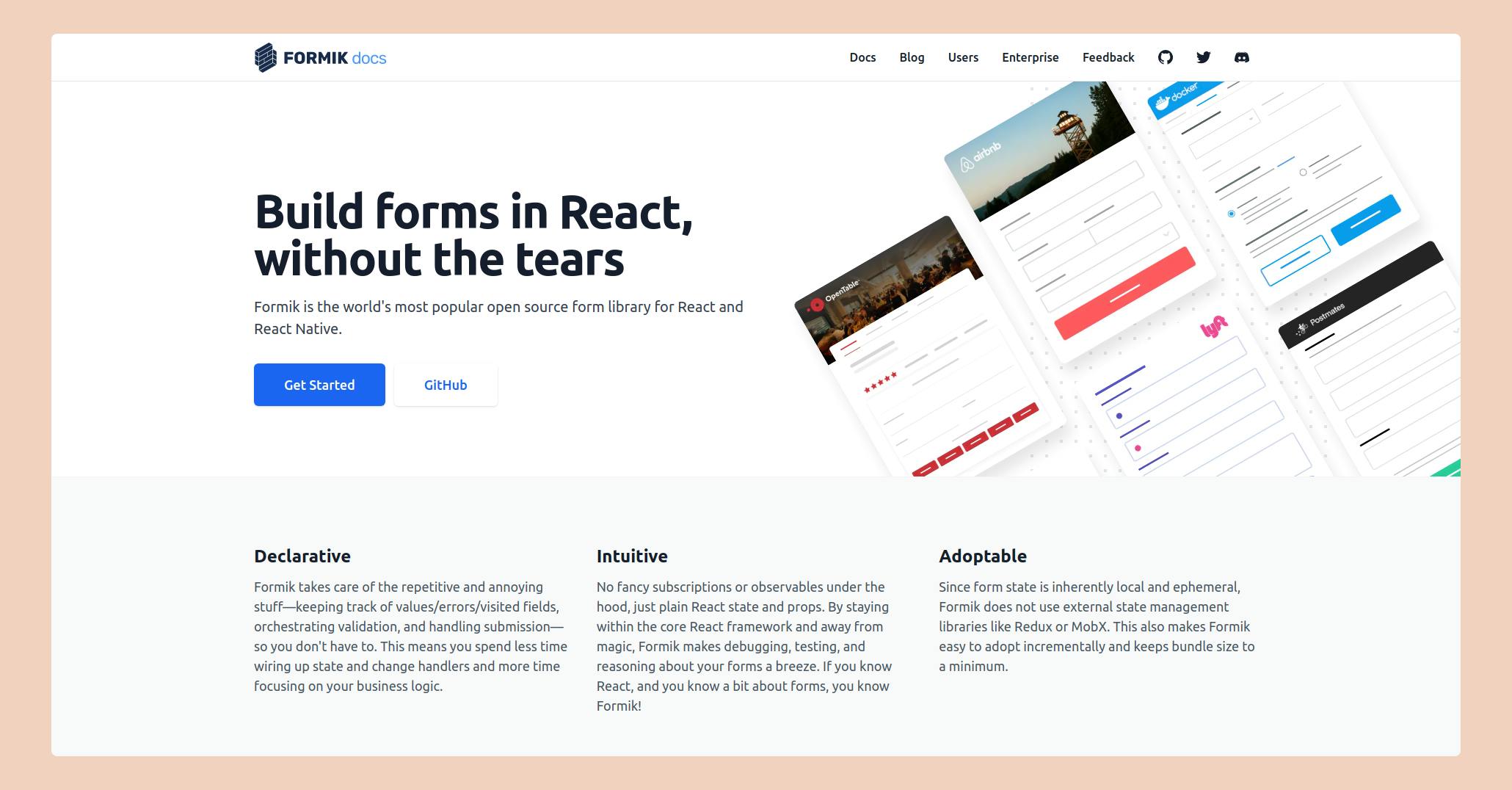
Formik is a small group of React components and hooks for building forms. It helps with the three most annoying parts: Getting values in and out of form state. Validation and error messages.
Installation
- Using NPM
npm install formik --save
- Using Yarn
yarn add formik
Usage
 import React from 'react';
 import { useFormik } from 'formik';

 const SignupForm = () => {
   // Pass the useFormik() hook initial form values and a submit function that will
   // be called when the form is submitted
   const formik = useFormik({
     initialValues: {
       email: '',
     },
     onSubmit: values => {
       alert(JSON.stringify(values, null, 2));
     },
   });
   return (
     <form onSubmit={formik.handleSubmit}>
       <label htmlFor="email">Email Address</label>
       <input
         id="email"
         name="email"
         type="email"
         onChange={formik.handleChange}
         value={formik.values.email}
       />

       <button type="submit">Submit</button>
     </form>
   );
 };
Styled Components
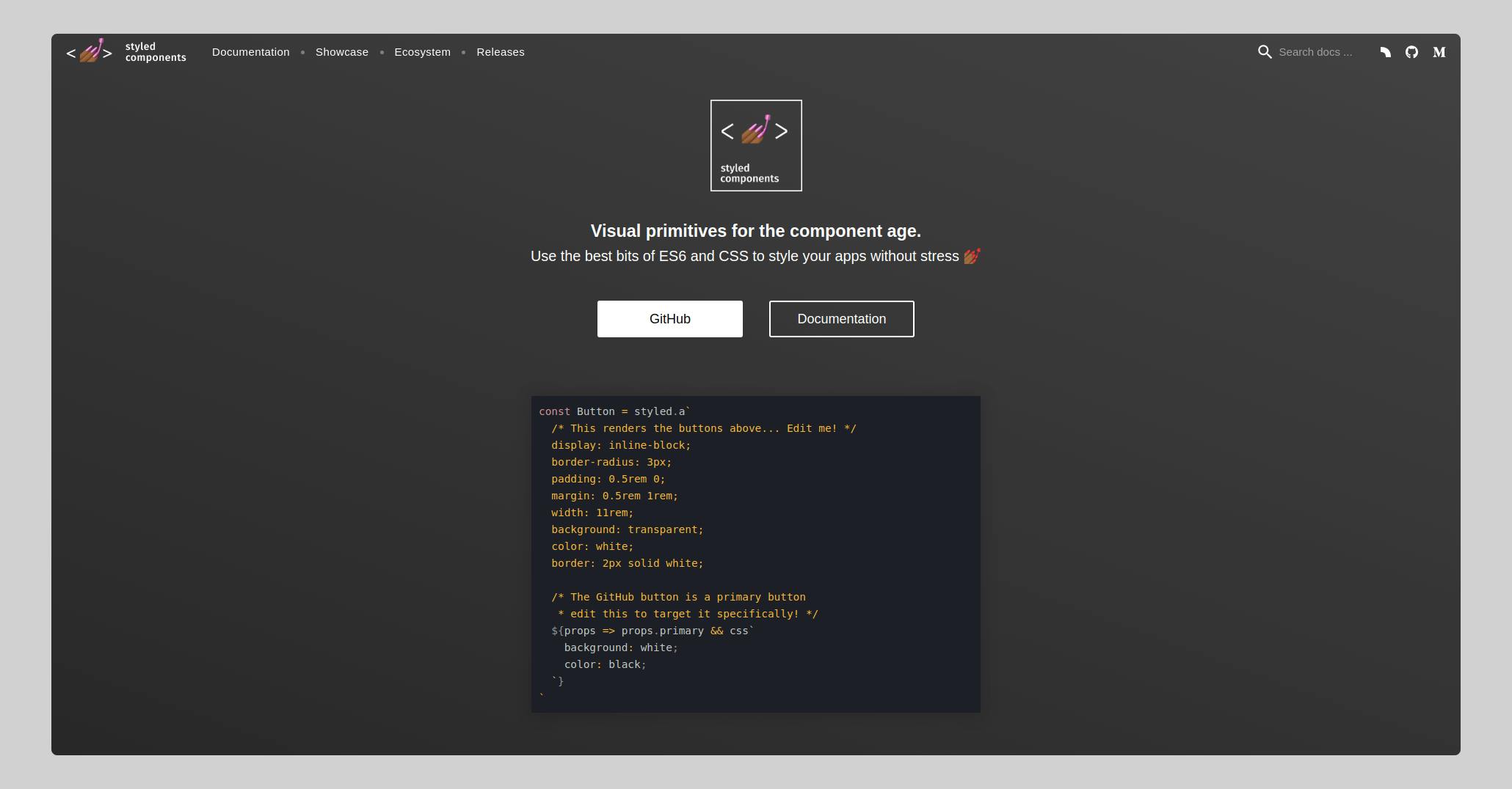
Styled Components is a CSS tool that makes your React project run more smoothly. This package enables you to construct reusable, tiny components that are crucial to your application's design.
Installation
- Using NPM
npm install --save styled-components
- Using Yarn
yarn add styled-components
Usage
import styled from "styled-components";

// Styled component named Button
const Button = styled.button`
  background-color: black;
  font-size: 18px;
  color: white;
`;

function MyComponent() {
  return <Button> Sign up </Button>;
}
Chakra UI
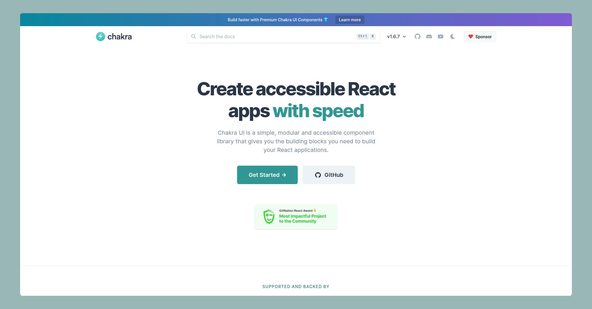
Chakra UI is a React component toolkit that seeks to help developers spend less time writing code and more time focusing on providing a great user experience. It provides you with the flexible, accessible, and easy user interface components you'll need to create apps.
Installation
-Using NPM
npm i @chakra-ui/react @emotion/react@^11 @emotion/styled@^11 framer-motion@^4
-Using Yarn
yarn add @chakra-ui/react @emotion/react@^11 @emotion/styled@^11 framer-motion@^4
Usage
import React from "react";
import { Button, ButtonGroup } from "@chakra-ui/react";
// Button: The button component with support for custom icons, spinners, etc.
// ButtonGroup: Used to group buttons whose actions are related, with an option to flush them together.

export default function MyComponent() {
  return (
    <div>
      <Button colorScheme="blue">Button</Button>
    </div>
  );
}

